Prototype of an ordering app for ‘Grilled!’ — a Bushwick, Brooklyn based vegan fast food establishment.
Why:
The mission of ‘Grilled!’ is to make vegan fast food affordable and accessible in the community. I created an ordering app to further this goal by making it easy to order food and to view current offers and promotions. ‘Grilled!’ is a relatively new establishment and does not currently have a website or app, unlike its direct competitors.
↓
Competitive Analysis:
I downloaded three ordering apps to analyze- Sweetgreen, Cava, and Burger King. Sweetgreen and Cava are direct competitors of Grilled as they are relatively cheap, vegan friendly takeout spots with locations in Brooklyn. Burger King is an indirect competitor of Grilled- it has locations nearby and serves the meat version of Grilled's menu. I chose this app to see the design approach to the traditional fast food menu.
↓
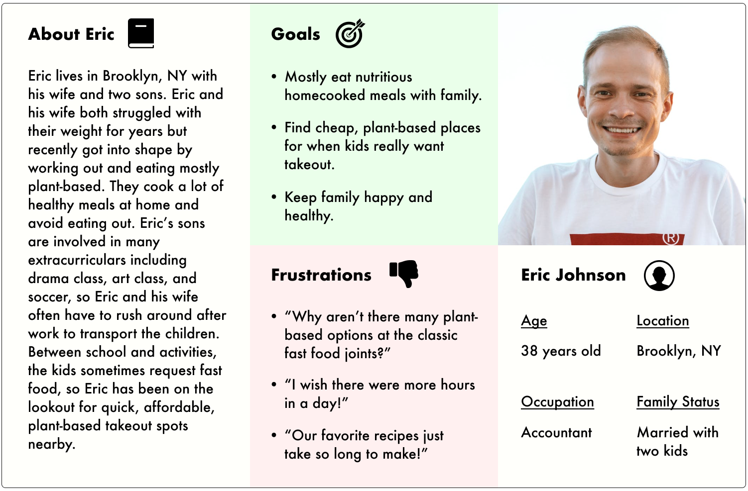
Personas:
Using Figma, I created two personas to explore the needs of potential users and how they would interact with the app.
↓
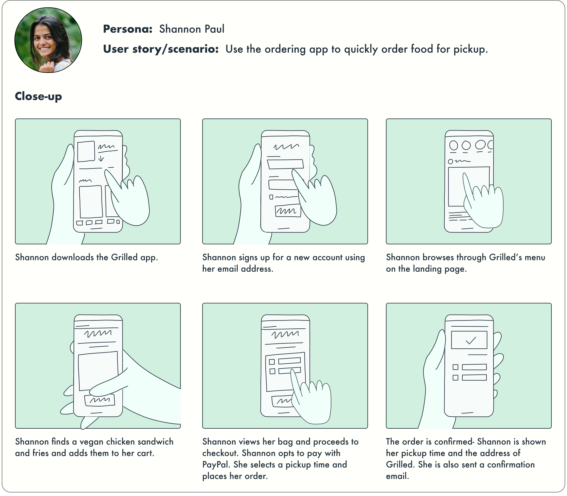
Storyboarding:
I decided to focus in on persona 'Shannon Paul' and create UX storyboards for her use of the ‘Grillled!’ app. The storyboards were created in Figma using the UX Storyboard Mix-&-Match Illustration Library by Lucian Popovici.
↓
Wireframes:
Through my research, I gained an idea of what I generally wanted the ‘Grilled!’ app to look like, so I began sketching some prototypes in Procreate on iPad. After a bit of trial-and-error, I opened Figma and created low fidelity wireframes to get a sense of what worked best for navigating through the app. I experimented with different layouts until I found what worked most effectively for efficient browsing and ordering. I aimed to create something with a clean, simple layout, and a focus on the food being offered.
↓
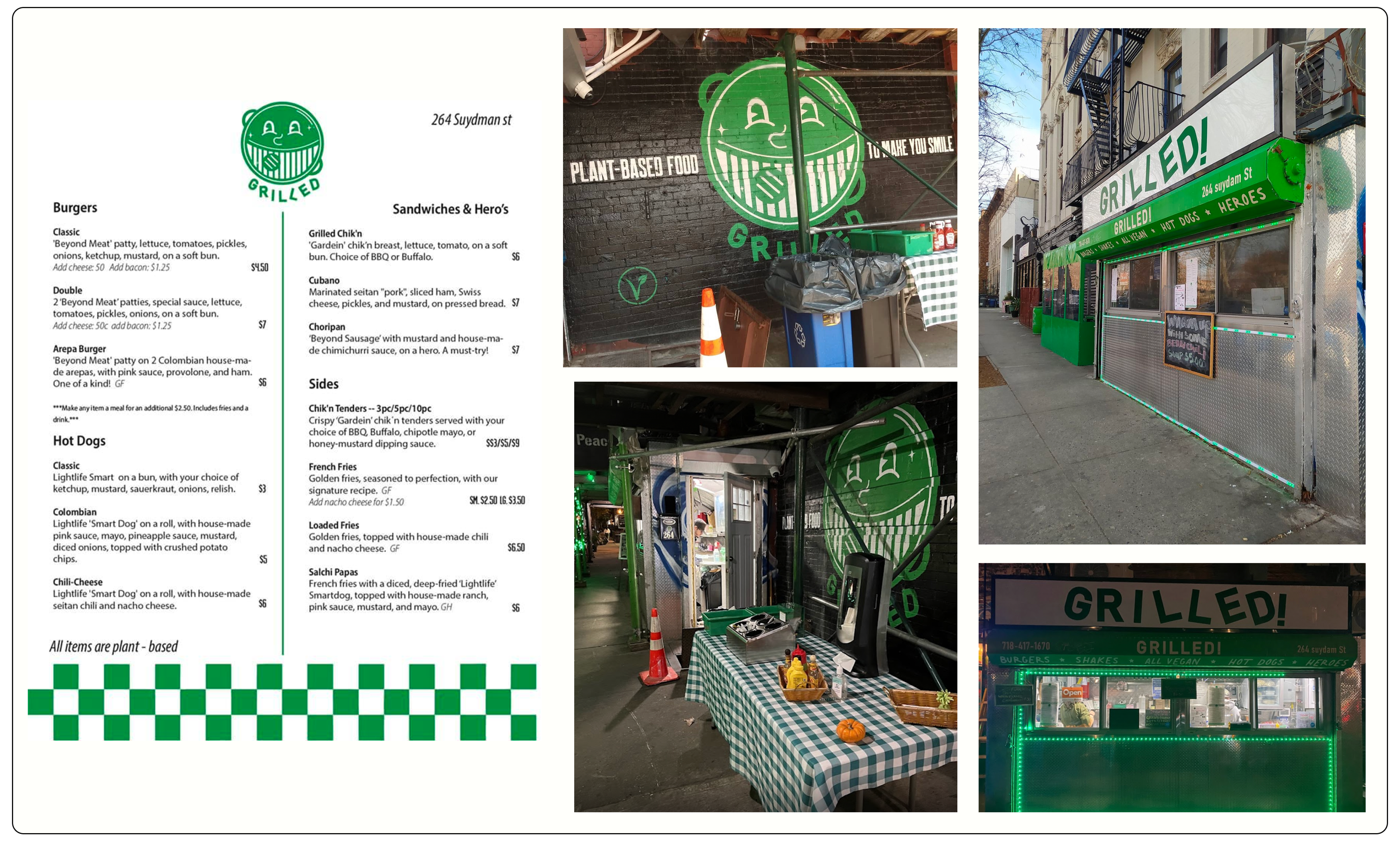
Inspiration:
Before working on the high fidelity prototype, I gathered images of the ‘Grilled!’ storefront and the menu they have posted at the business. I wanted the prototype to have a similar look to the existing aesthetic but also be well suited for a mobile app.
↓
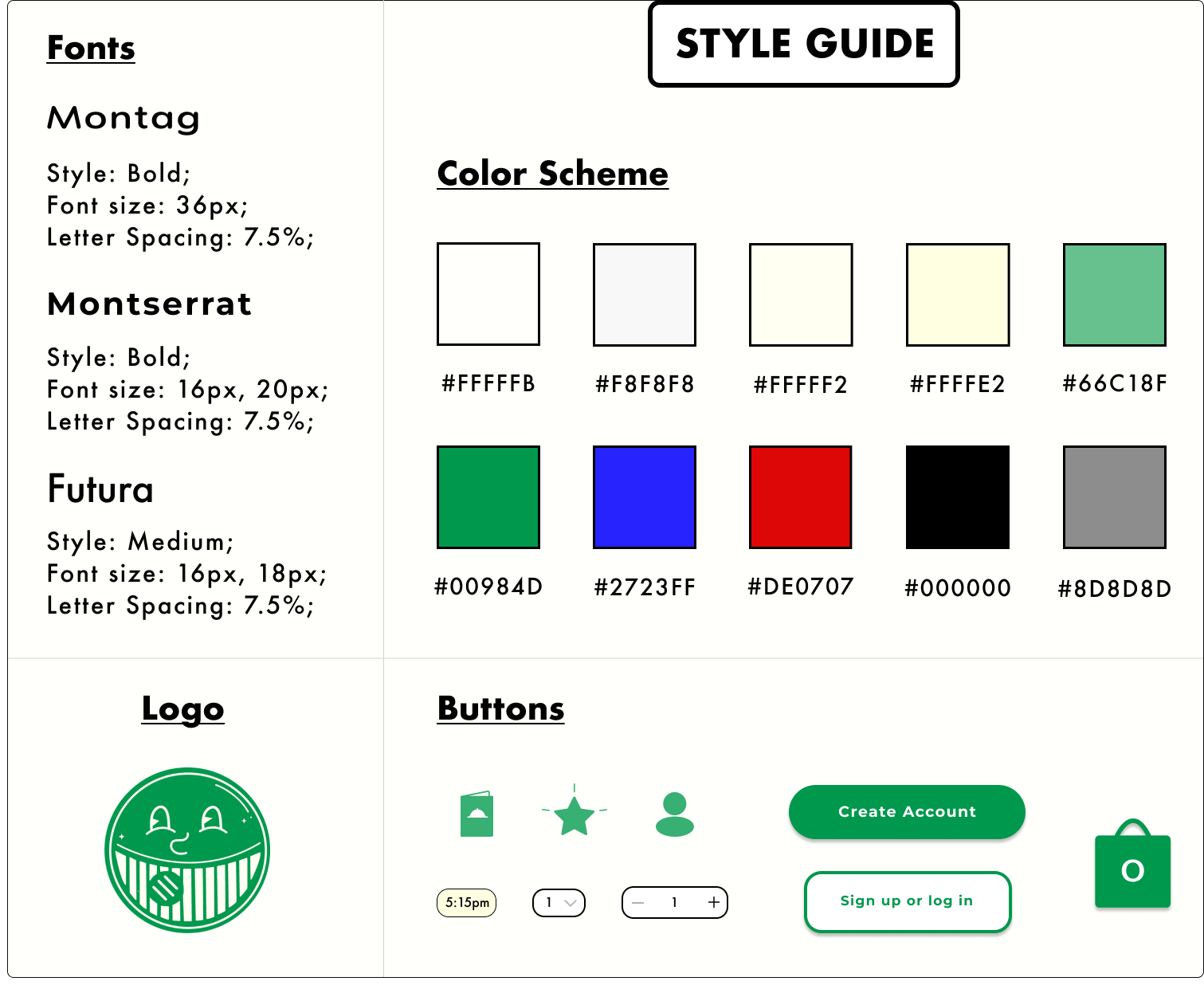
Design:
After designing a few screens of the high fidelity prototype, I created a style guide to maintain consistency throughout the entire app. I built a very simple color scheme consisting of cream, green, and black, with some links of blue and red. These colors were pulled from the existing ‘Grilled!’ branding and were adapted to make the app look modern and crisp. I experimented with different color combinations pulling from the ‘Grilled!’ storefront but ultimately found the subdued color scheme to look the nicest. I also experimented with the fonts and branding on the app and tried replicating the crooked look of the word ‘Grilled!’ but found that it didn’t translate well onto mobile. I ended up choosing fonts that are clean and legible to maximize usability. The custom icons and buttons were created using Adobe Illustrator and Figma.
↓
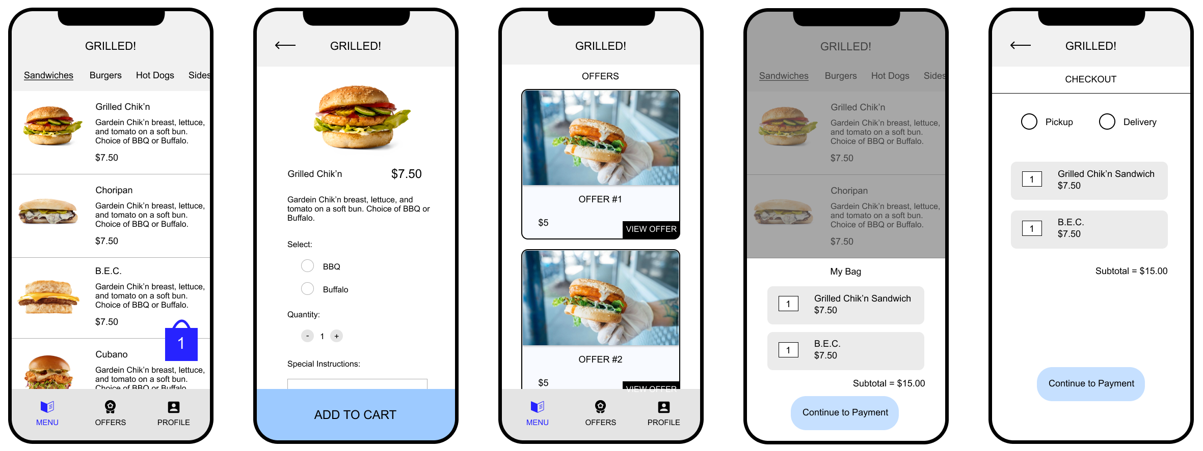
Final product:
Below is the final prototype of the 'Grilled!' ordering app. Feel free to reach out to me with any feedback you have on my case study!